I Asked an AI to "Roast" My Landing Page, and Honestly? I Deserved It.
Why your beautifully coded website might actually be a user experience nightmare, and how AI can bully you into fixing it.
We’ve all been there. You have just spent the last three weeks living on caffeine and determination while pushing pixels until 4 AM. You finally deploy your side project. To you, it is a masterpiece. The React components render flawlessly. The backend is optimized. It is your child.
Then you show it to a friend. They squint at the screen and ask, "So… what does it actually do?"
The pain is real. As developers and indie hackers, we suffer from a chronic condition I call "Creator’s Blindness." We are so deep in the code that we forget what our landing page looks like to a human being who has never seen our GitHub repo.
Usually, fixing this requires hiring a UX consultant (expensive) or begging strangers on Reddit for feedback (terrifying). But recently, I stumbled upon a tool that promised to do the heavy lifting without the awkward small talk: Roast My Web.
Here is what happened when I let an AI tear my digital baby apart.
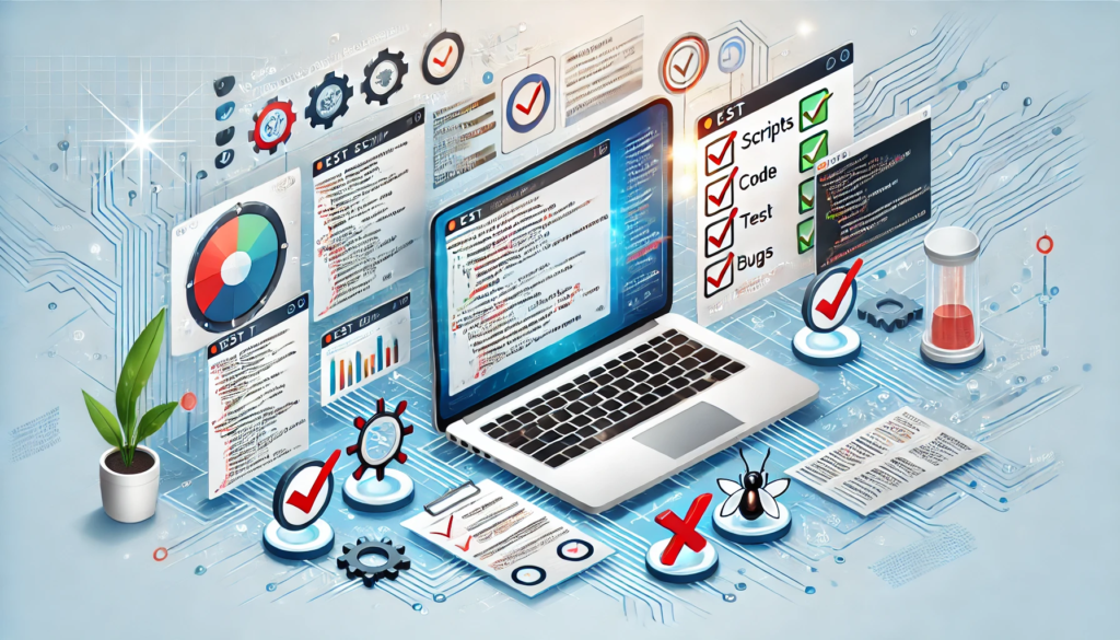
The "Roast" as a Service
The concept of Roast My Web is simple. You feed it your URL, and it uses AI (specifically GPT-Vision and other analysis models) to "see" your website. It does not just parse the HTML. It looks at the design, the layout, and the copy like a user would.
And then, it judges you.
I decided to test it on a landing page I had been working on, a page I thought was pretty solid. I pasted the link, hit the button, and waited for the verdict.
The Verdict: 59/100 on Conversion. Ouch.
The report did not hold back. It gave me scores across different categories: Design, UX, Content, and Conversion.
I scored a decent 87/100 on aesthetics (validation!), but my conversion score was a tragic 59/100.
Instead of vague advice like "make it pop," the AI gave me specific, actionable, and occasionally savage feedback. Here are a few gems from the report:
- The Hero Section Roast:
- The Feedback: "Refine the headline to directly address the user's benefit. Currently, it’s too abstract."
- Translation: "Stop trying to be clever. Nobody knows what 'Synergizing the Future' means."
- The Call-To-Action (CTA) Roast:
- The Feedback: "Warning: Moderate to fix. Implement a secondary CTA for users not ready to start immediately."
- The Reality Check: I had one giant 'BUY NOW' button and nothing else. I was basically proposing on the first date.
- The "Mobile View" Reality:
- It pointed out that while my desktop view was art, my mobile view had padding issues that made my testimonials look like a hostage note.
Why This Beats "Looks Good, Bro"
The problem with asking friends for feedback is that they are nice. They do not want to hurt your feelings. Roast My Web does not care about your feelings. It cares about best practices.
The tool broke down the fixes by ROI (Return on Investment). It told me, "Fixing this headline will take 2 minutes but will likely increase conversions more than that complex animation you spent 5 hours on."
It also allowed me to compare my site against competitors. It is one thing to know your site is slow. It is another thing entirely to see that it is 40% slower than the guy ranking #1 on Product Hunt.
The "Indie Hacker" Advantage
For bootstrapped founders, this kind of tool is a weapon. We often launch MVPs (Minimum Viable Products) that are functionally great but visually confusing. We lose users in the first 3 seconds because our hierarchy is off or our value proposition is buried in a wall of text.
By using an automated audit, you get:
- Objectivity: AI does not know how hard you worked on that div. It only sees that it is misaligned.
- Speed: I got a full audit in minutes rather than the days it takes to schedule a consultation.
- Actionable Code/Design Changes: It did not just complain; it told me what to change to fix the scores.
Conclusion: Embrace the Roast
After the initial shock of seeing my conversion score in the red, I spent an hour implementing the "Easy to Fix" suggestions. I sharpened the copy, added social proof near the CTA (as suggested), and fixed the mobile padding.
The result? The page did not just look better; it made sense.
If you are sitting on a landing page right now, wondering why visitors are bouncing, stop guessing. Go get roasted. It might sting a little, but as the old saying goes: "The code compiles, but the design is what sells."
Disclaimer: I am affiliated with Roast My Web, I built the tool to save me from my own bad design choices.
\
You May Also Like

YoungHoon Kim Predicts XRP Price Surge Amid Institutional Demand
Why Reference-to-Video Is the Missing Piece in AI Video — and How Wan 2.6 Solves It